Some graphs
I was looking for sets of data to play around with and I came across the Waterloo Regional Police Service data that is available to the public. I created some graphs of the data for the reader to check out. The data was filtered for vehicle stops for the year 2015. Time and location data was plotted. If you are interested in the scripts used in generating the plots, then let me know.
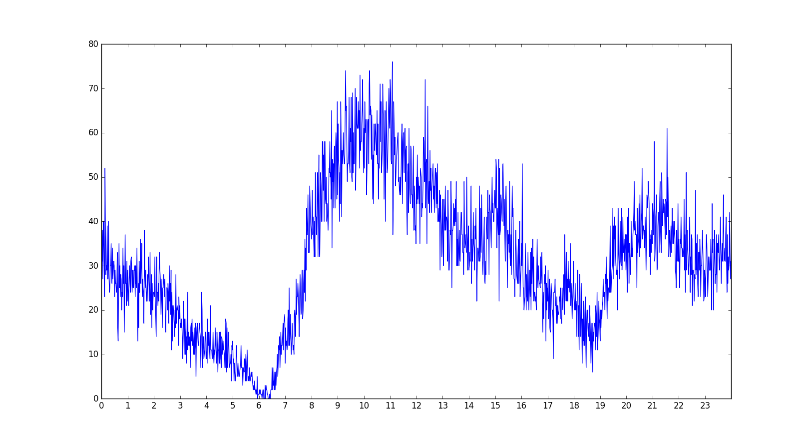
The following image contains a sort of histogram that placed the stops in bins based on their time of day occurence in a 24 hour time span.
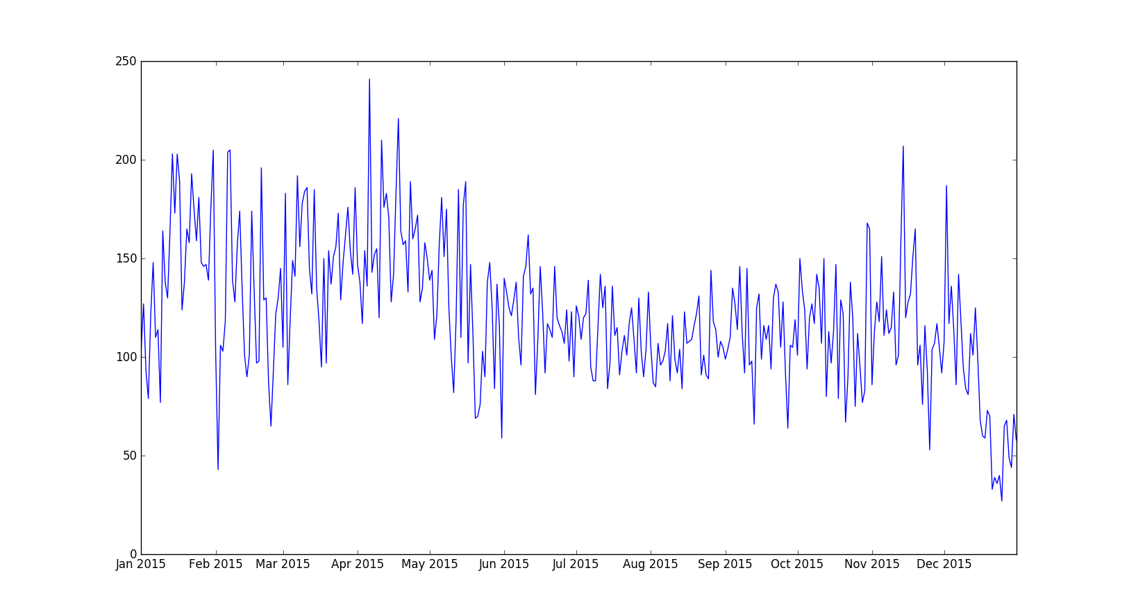
The next image is similar to the previous one, except now it places the stops in bins based on the day of the year in a one year span.
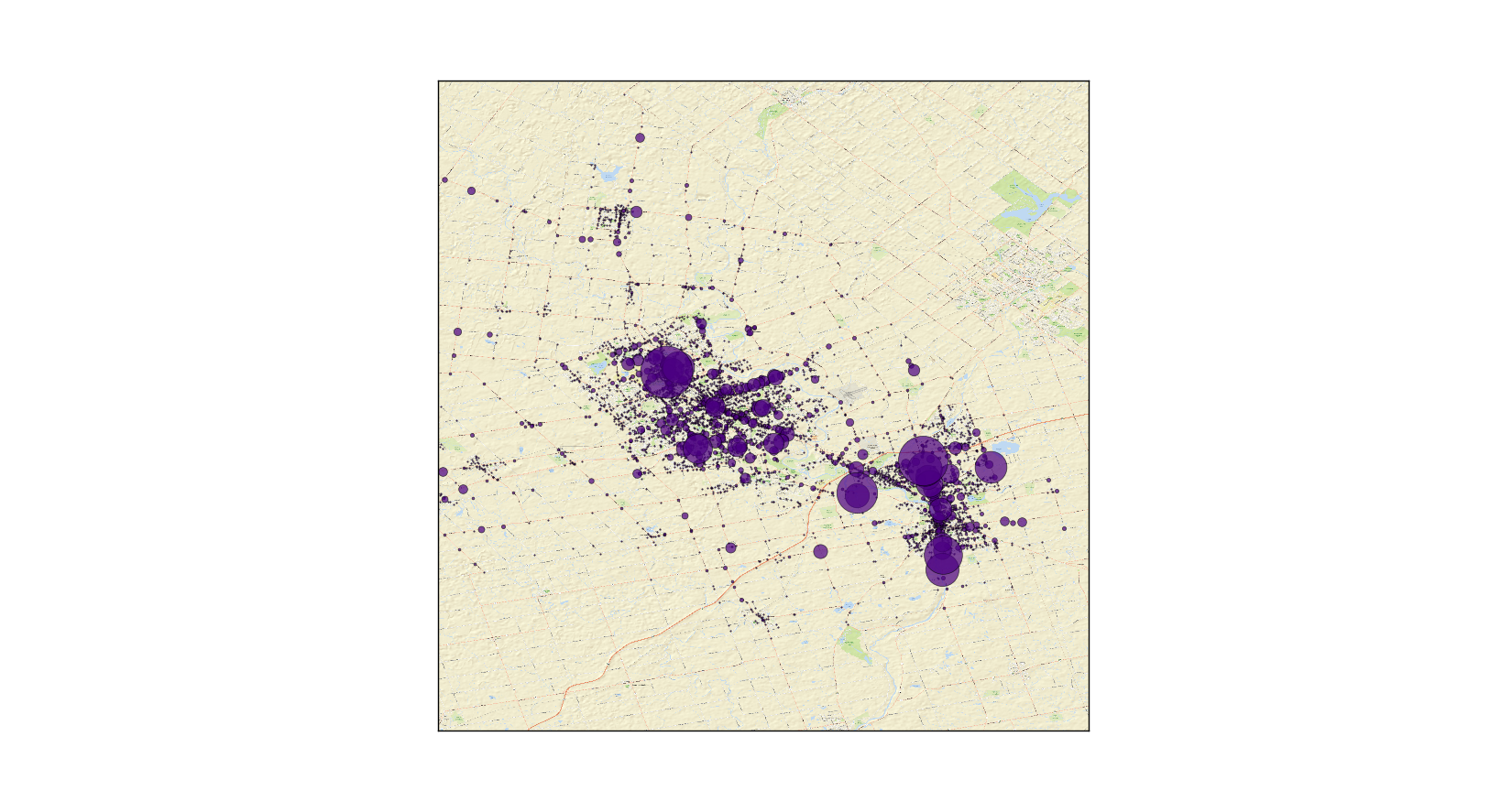
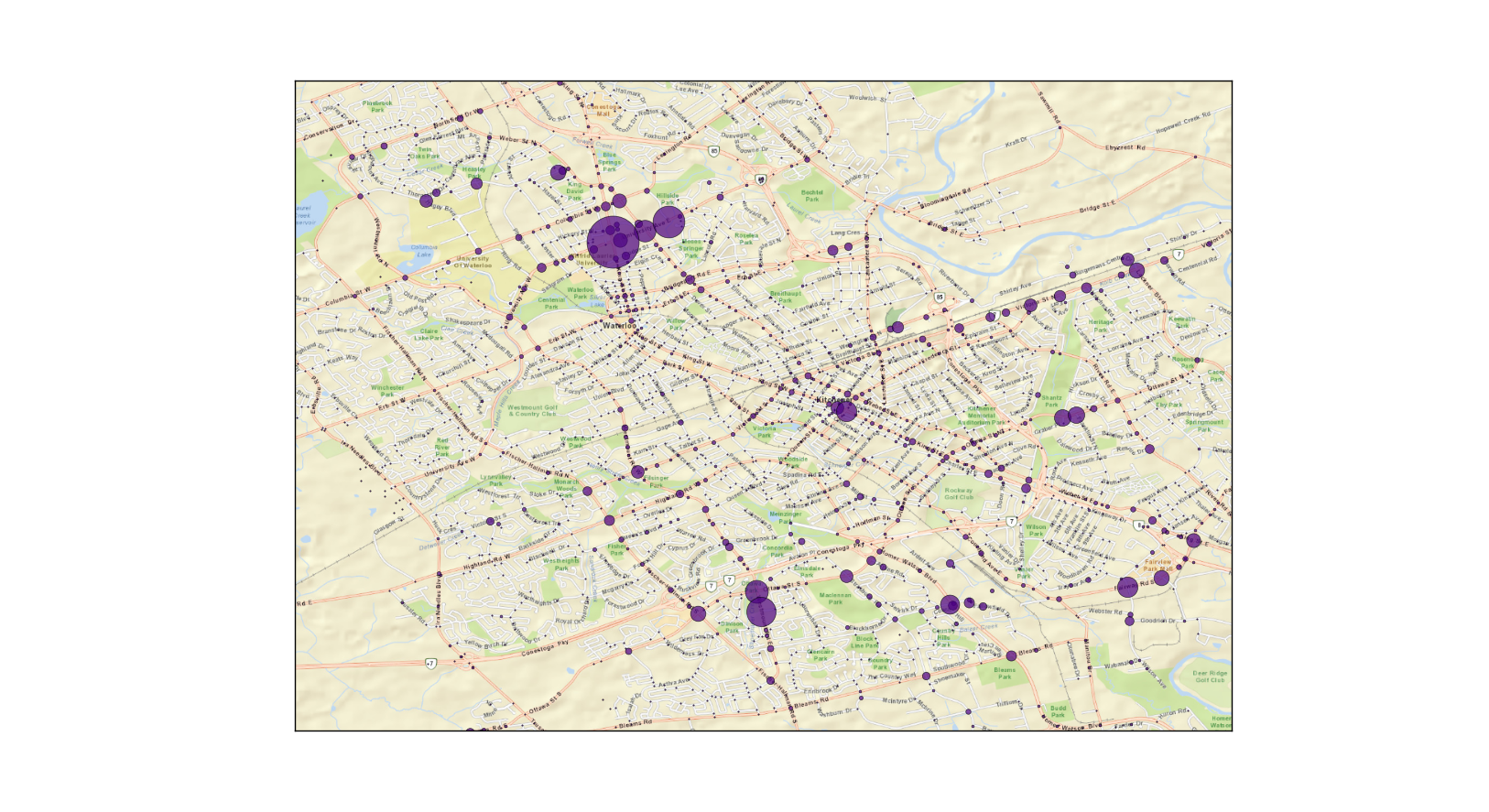
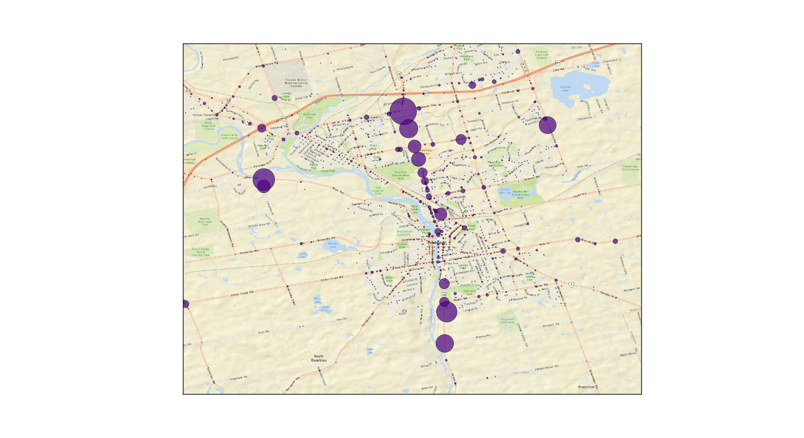
The next few images are of the location based frequency of vehicle stops based on an entire year.
Tri-city area:
Waterloo area:
Cambridge area:
It can be hard to appreciate the number of stops done throughout the year by looking at the maps or previous histograms. The actual number of stops is over 40000. I will let the user make ‘conclusions’ on their own. The purpose of the post was not for analysis but instead for a small example of visualization and turning a huge csv file into a some neat graphs and plots. I will also provide the disclaimer for the users to go to the Waterloo Regional Police Service website if they want to learn more about the data and its limits.