Summer Start
Just finished another term at University of Waterloo. This term was very interesting and at the same time tough. I took PHYS122, AMATH353, CS371 and CS343. In addition, I started working on a University Research Assistant (URA) project which I will post more details later on. Currently doing a work term and enjoying the beautiful summer term and increase in free time.
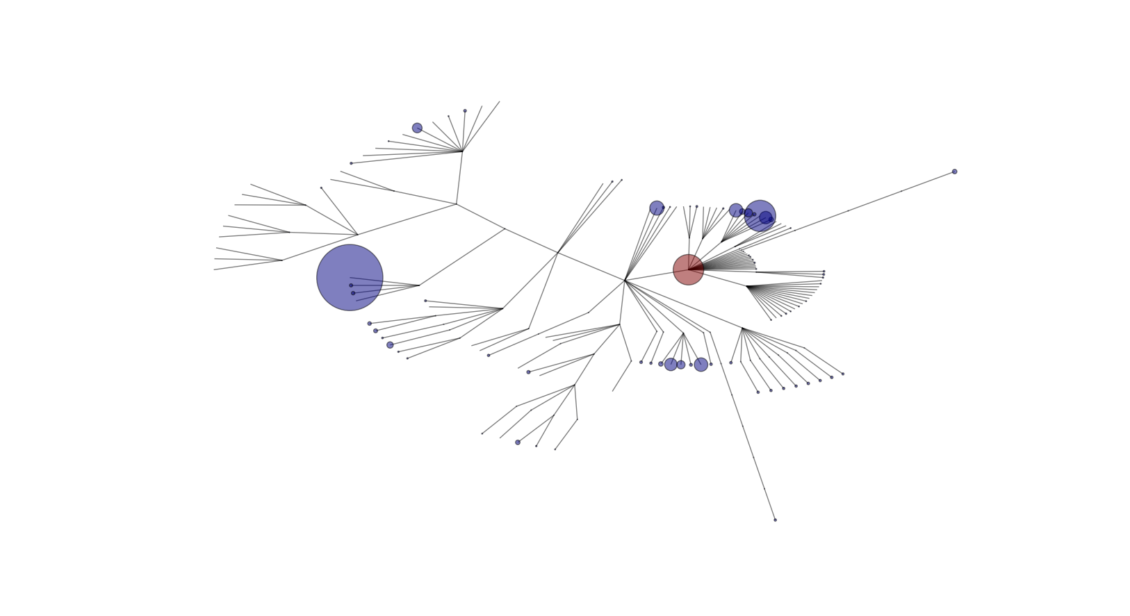
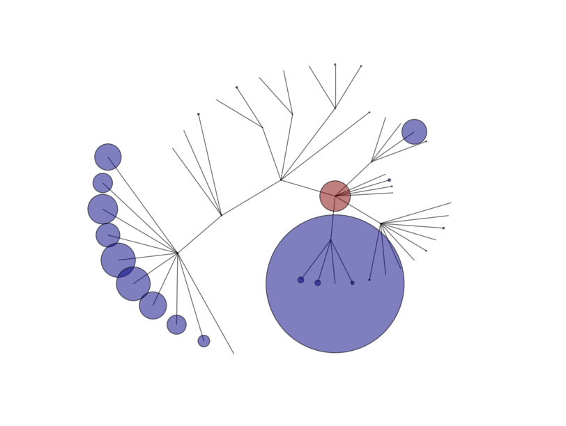
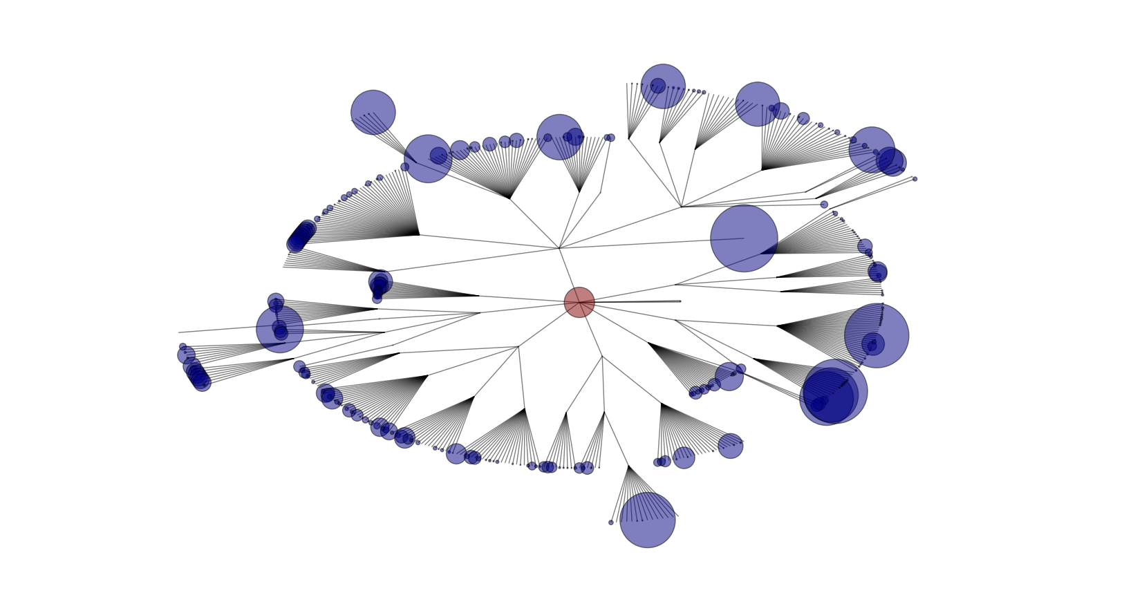
I was recently playing around with a little bit of data visualization. Here is a little script I wrote that can map out the directory the script is currently in. The red dot represents the root directory and the leafs of the tree where the blue circles represent the file size. The vertex with more than one edge connecting to it represent a directory.
Here is a mapping of this website:
Here is a mapping of the directory mapping of my URA project:
Here is a mapping of my course work for the past two terms:
And finally a combination of the past three directories:
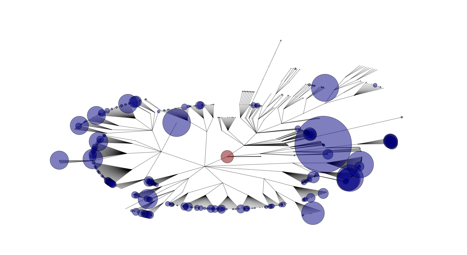
Unfortunately, the current script doesn’t scale too well for large file structures, but the script can be easily adjusted for that if necessary.
Here is the script (updated and better version).